Caption:
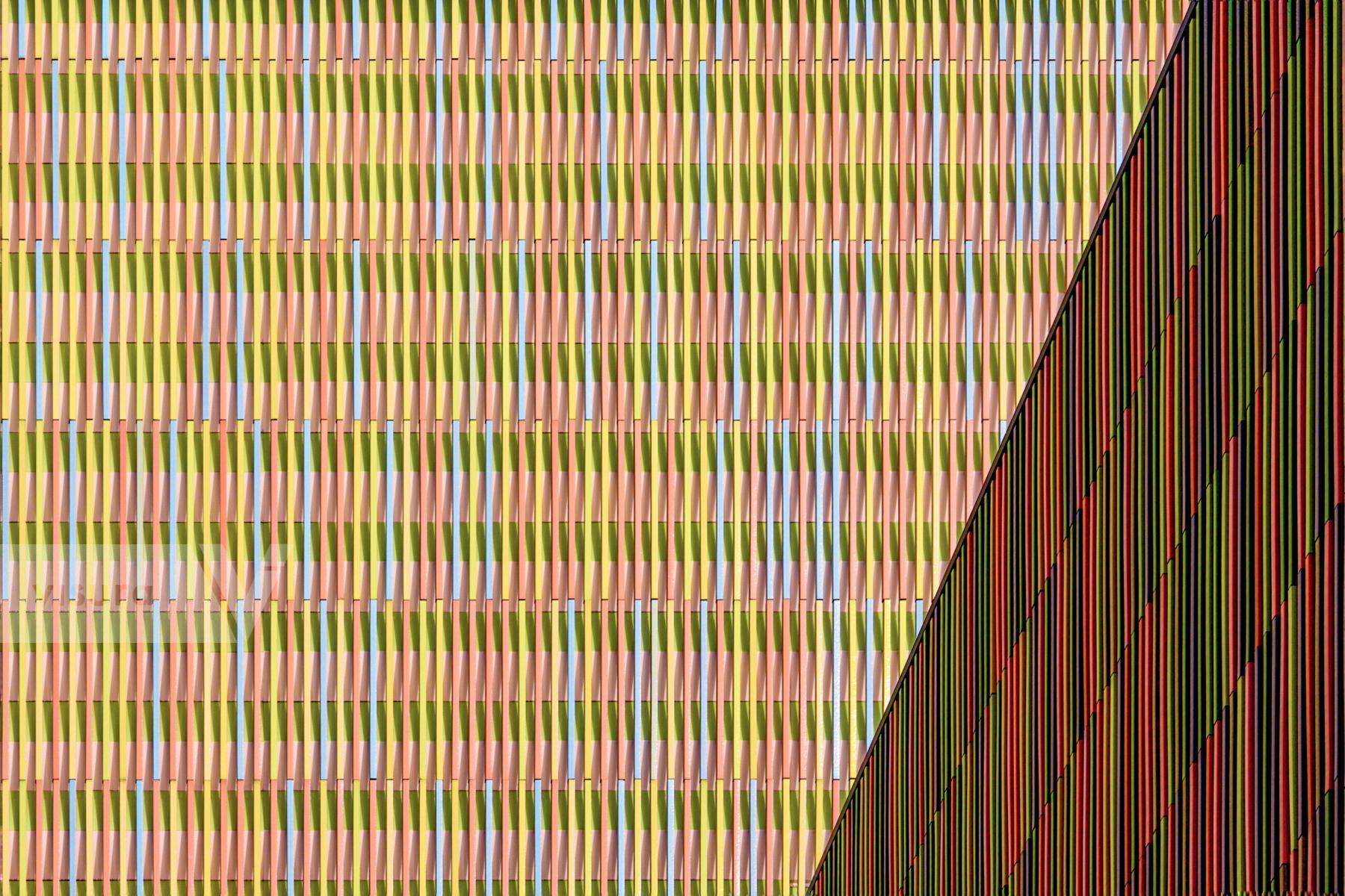
The facade is a captivating blend of color and texture. The left side showcases a vibrant patchwork of rectangular ceramic rods in various shades of green, yellow, pink, and blue. These tiles are arranged in a seemingly random yet harmonious pattern, creating a lively and dynamic visual effect. In contrast, the right side presents a more subdued composition with vertical stripes of black and red ceramic tiles. This section provides a counterpoint to the vibrant left side, adding depth and contrast to the overall design. The color palette is rich and diverse, ranging from warm earth tones to cool blues and greens. The contrast between the bright colors on the left and the darker tones on the right creates a visually engaging interplay. The ceramic rods impart a textured quality to the facade, adding visual interest and depth. The slight variations in the size and placement of the tiles contribute to the overall dynamism of the design. While the left side appears somewhat chaotic, there's an underlying order to the arrangement of the tiles. The right side's vertical stripes offer a sense of structure and balance.The juxtaposition of the vibrant left side with the more subdued right side creates a strong visual contrast, drawing the viewer's attention and enhancing the overall impact of the facade. Overall, the Brandhorst Museum's facade is a remarkable example of architectural design that successfully integrates color, texture, and pattern to create a visually stimulating and memorable experience. Architect Sauerbruch Hutton
Size: 2618h x 3927w